STUDIO SANDER PATELSKI - POSTERS
DÉPVIIROOM #2
Posters Collection by Studio Sander Patelski
“I have a great love for architecture, graphic design and visual arts from the first half of the last century. In essence, the posters I make are an ode to that time when there were many developments in that area, and to which we still refer to when designing and decorating our homes.
I really like the compositional discipline and the straightforwardness of the architecture of that time."
Colección de pósters de Studio Sander Patelski
«Tengo una gran pasión por la arquitectura, el diseño gráfico y las artes visuales de la primera mitad del siglo pasado. En esencia, los pósters que diseño rinden homenaje a esa época donde hubo una gran evolución en este área y a donde seguimos recurriendo para diseñar y decorar nuestros hogares hoy en día.
Me encanta la disciplina en la composición y lo lineal de esa arquitectura.»
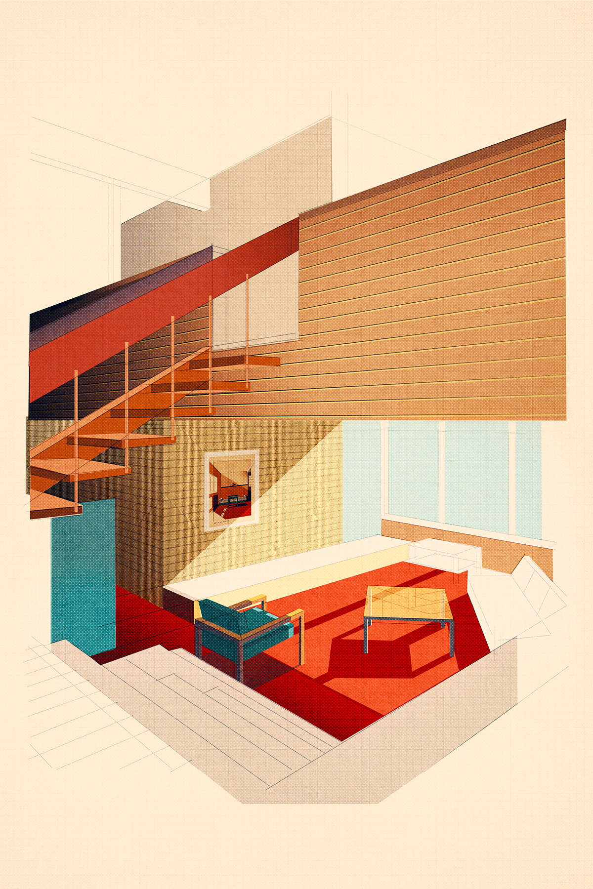
Blue Chair
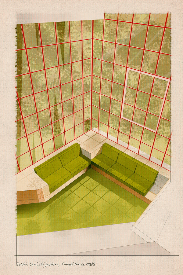
Forest House 1975
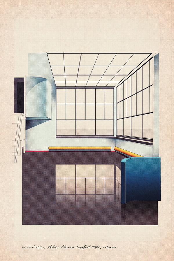
Ozenfant Interior
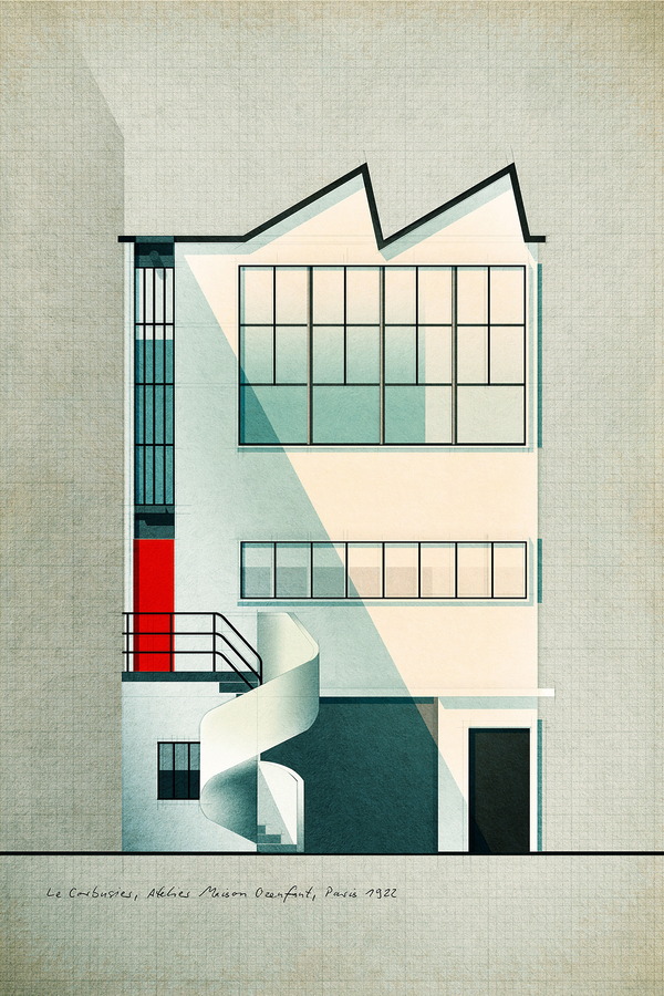
Ozenfant Exterior
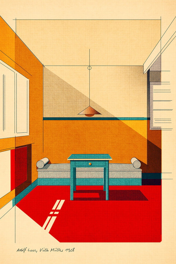
Loos Villa Muller
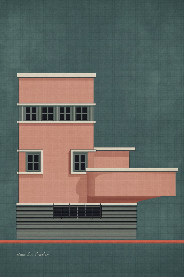
Haus Dr. Fischer
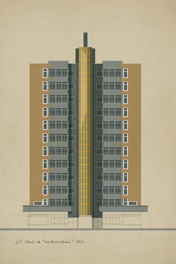
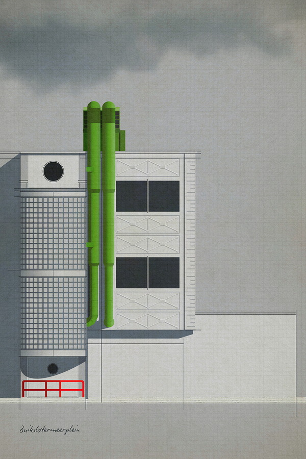
J.F. Staal, Wolkenkrabber
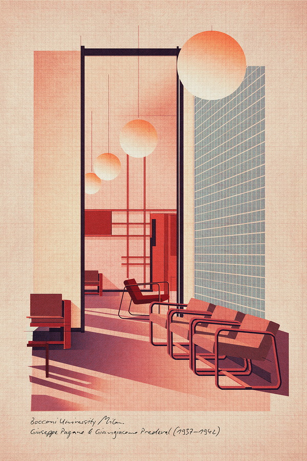
Bocconi Milano
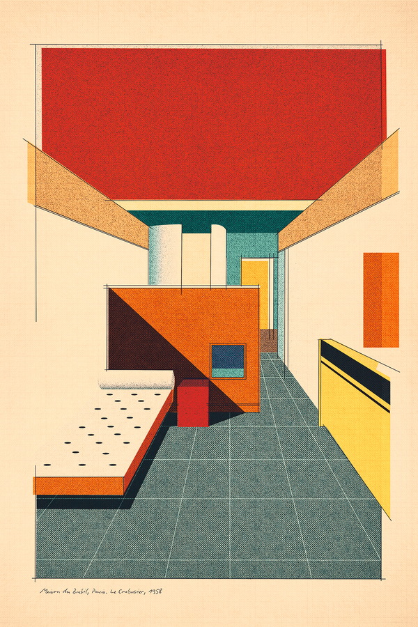
Bresil
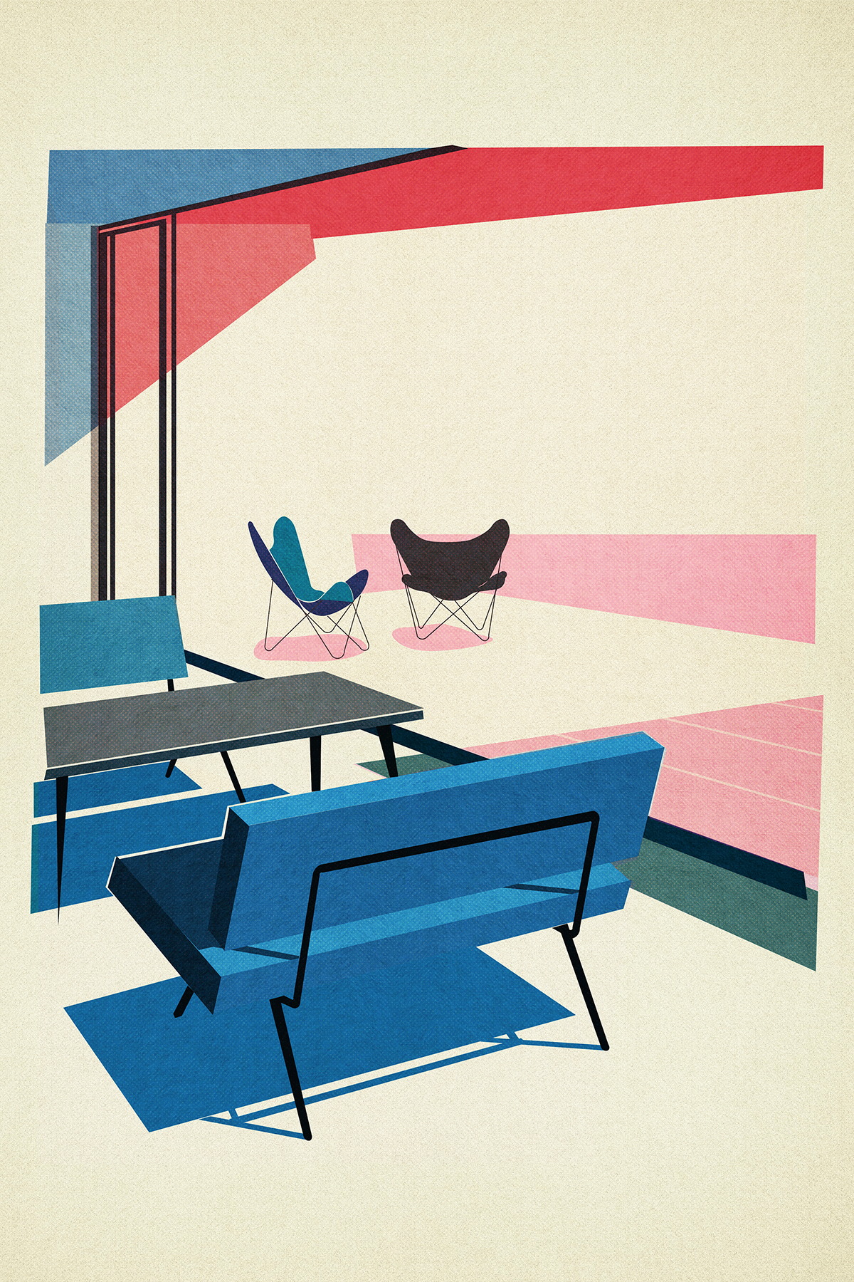
50s Interior
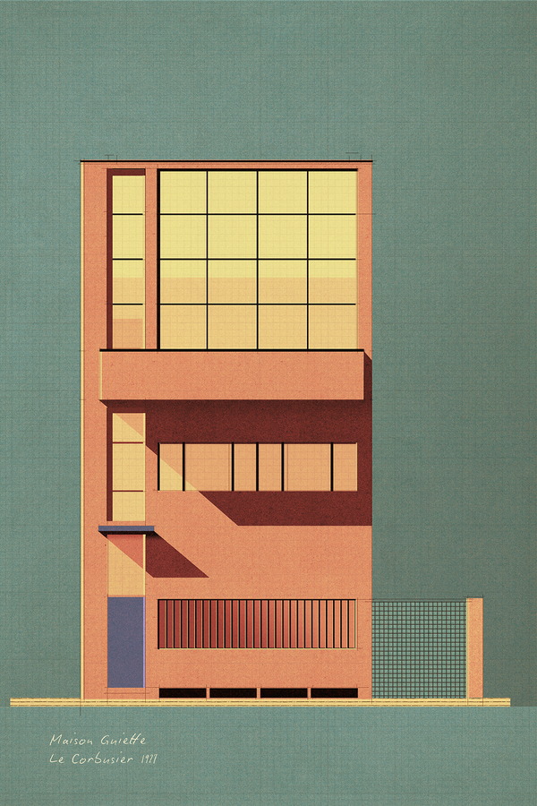
Maison Guiette
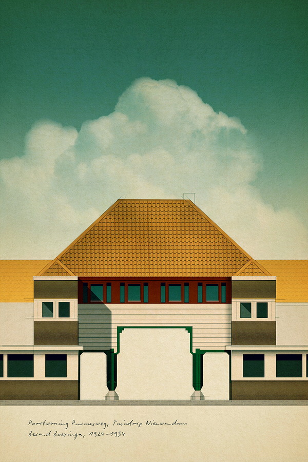
Purmerweg
Kantoor
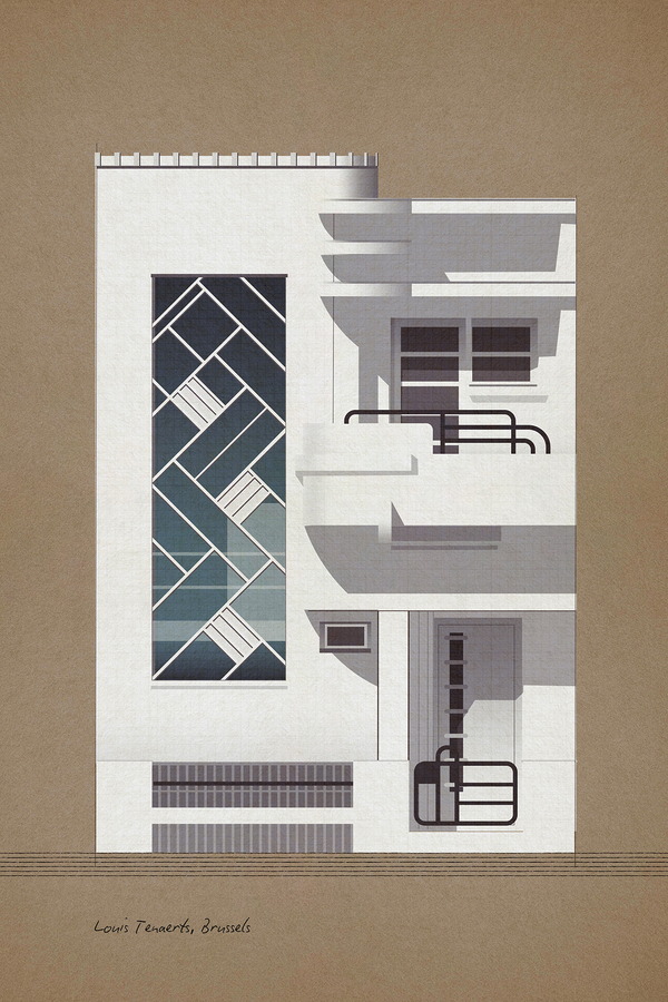
Louis Tenaerts 1933
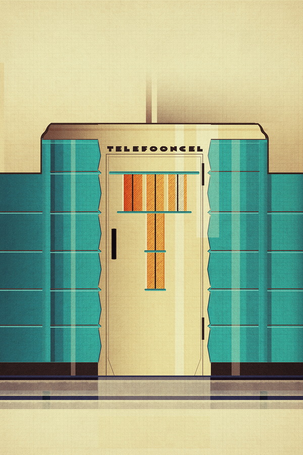
Telefooncel
FACT SHEET
Technique used | Photoshop.
Colour palette | Mostly unsaturated. Paper textures and halftone patterns to evoke a sense of authenticity.
Sizes | 40x60cm or 60x90cm.
Other specifications | Giclée prints on Hahnemühle German Etching paper.
In one word | Nostalgic.
*Available here.
FICHA TÉCNICA
Técnica utilizada | Photoshop.
Paleta de color | En su mayoría desaturados. Textura papel y patrones de tono medio para evocar sensación de autenticidad.
Tamaño | 40x60cm o 60x90cm.
Otras especificaciones | Impresión Giclée en papel Hahnemühle German Etching.
En una palabra | Nostalgia.
*Obra disponible aquí.
Q&A
Q1. How would you describe your approach to design?
To get ideas I spend a lot of time on Instagram and Pinterest, both for my own work and for the commissions I do as a book cover designer.
As a basis, I draw a building or interior as precisely as possible, but in a sketchy style. When colouring, I let go of the example and I am only concerned with the search for the right atmosphere: in colour, shade and light. I deliberately leave the sketch underneath, it adds vibrancy.
Q2. Apart from the collection we are featuring, is there a project within the studio you feel especially fond of?
Last year I did the redesign of the “Salamender” Pocketbook Series, very well known here in the Netherlands.
I was also inspired by art from the first half of the last century. In imagery, in typography, even the choice of paper. I am very happy with the result.
Q3. We see a clear architectonic pattern across your poster designs. Is this something that usually inspires your work? Tell us a bit more about the specific inspiration for this collection.
I have a great love for architecture, graphic design and visual arts from the first half of the last century.
In essence, the posters I make are an ode to that time when there were many developments in that area, and to which we still refer to when designing and decorating our homes. I really like the compositional discipline and the straightforwardness of the architecture of that time.
P1. ¿Cómo describirías tu proceso creativo al diseñar?
Durante la búsqueda de ideas paso mucho tiempo en Instagram y Pinterest, tanto para mi propio trabajo como para los encargos que recibo en mi faceta de diseñador de portadas de libros.
Como base, dibujo los edificios o interiores de la manera más precisa posible. Al añadir el color me aparto del ejemplo inicial y me centro en crear una atmósfera con los colores, las sombras y las luces. Dejo que se vea el borrador inicial a propósito, creo que le añade energía a la obra.
P2. Aparte de la colección que hemos publicado, ¿hay algún proyecto del estudio del que te sientas particularmente orgulloso?
El año pasado rediseñé la serie de libros de bolsillo de la editorial “Salamender”, muy conocida aquí en Holanda.
También encontré la inspiración en conceptos de la primera mitad del siglo pasado. El imaginario, las tipografías, incluso la elección del papel. Estoy muy contento con el resultado.
P3. Vemos una clara influencia arquitectónica en esta colección de pósters. ¿Es algo que suele inspirar tus diseños? Cuéntanos un poco más sobre la colección.
Tengo una gran pasión por la arquitectura, el diseño gráfico y las artes visuales de la primera mitad del siglo pasado.
En esencia, los pósters que diseño rinden homenaje a esa época donde hubo una gran evolución en este área y a donde seguimos recurriendo para diseñar y decorar nuestros hogares hoy en día. Me encanta la disciplina en la composición y lo lineal de esa arquitectura.